Grid
The function of Grid component is similar to List component. The only different thing is the format of listing data can be separate into number of columns.
Usage
In most of the cases, "Grid" component will be used together with "Connect Server" component to read data from server and display the lists of data into columns on screen.
Action [ Created | Refreshing ]
Simply click the action you want to define and drag components inside.
Created:
Mostly used to design the layout of each listed item within a column. Better use a "Cell" (In fact, Cell is a "Group" component) to contain layout of listed item and you will need to design one "Cell" only. Grid component will clone the design based on the number of data inserted and fill in corresponding content automatically.
| Spotify | Google Play Store | App Store |
|---|---|---|
 |
 |
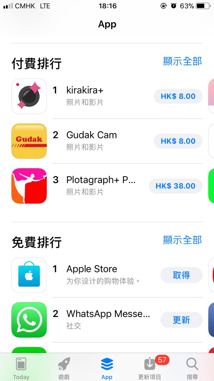 |
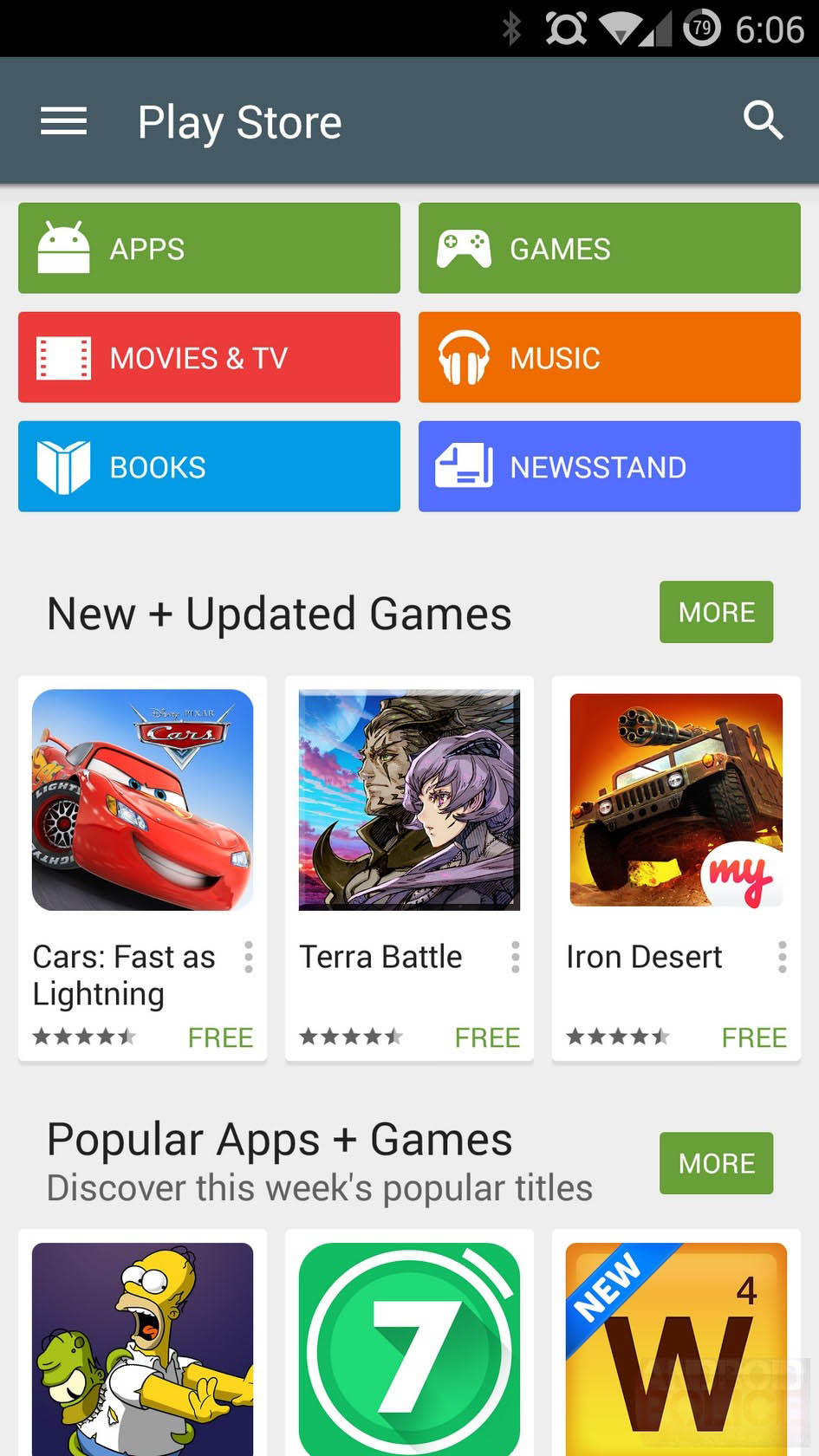
| Spotify use "Grid" to read category data from server and designed one cell layout of each category item. 2 columns in a row is set in this case. | Google Play Store use "Grid" to read app category data from server and designed one cell layout of each category item. 2 columns in a row is set in this case. | App Store use "Grid" to read hottest app data from server and designed one cell layout of each app item. Grid display horizontally and 3 columns in row is set in this case. |
Example
If you want design the layout of each item as "App Store" example above, you can simply start from a "Cell". The logic is showed below. ( ) is used to define the action we selected and [ ] is used to define the properties we set:
Grid [Column a Row: 3, Horizontal: Yes] -> (Created) -> Cell -> (Created) -> Group -> (Created) -> Image
                                                                          -> Group -> (Created) -> Text
                                                                                                -> Text
                                                                          -> Button -> (Created) -> Text
Refreshing:
It used to define action when user scroll down the grid to trigger refreshing action.
Example
If we want to read latest data from server once the grid is created or each time user trigger the refreshing action, we can make use of "Connect Server" component after refreshing action occurred. The logic is showed below. ( ) is used to define the action we selected and [ ] is used to define the properties we set:
Grid [Refresh on created: Yes] -> {refreshing} -> Connect Server
Properties
Simply click a gear on the right hand corner of related "Grid" component to edit the properties.
Columns a Row - It's used to define the number of columns in row to separate the cell listed.
Data Source - It's used to define the storage name of dataset you want to list out.
Refresh on created [ Yes | No ] - It's used to define if it's needed to trigger refreshing action when the Grid component created.
Horizontal [ Yes | No ] - It's used to define the item within Grid should be listed vertically or horizontally. Item will be listed horizontally if Yes is selected.
Paging [ Yes | No ] - TBC