Button
Button is designed to be a pressing item that can perform any actions after pressing motion detected. It’s also a key component to connect different pieces within an app.
Usage
In most of cases, we will drag a button, then make use of "created" and "pressed" action for designing the button UI and defining next action respectively.
Action [ Created | Pressed ]
Simply click the action you want to define and drag components inside.
Created:
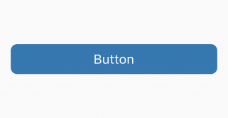
In most of cases, we may think that the button is something like the image above. In fact, button is just a component to provide pressing motion detection and no user interface at all. Therefore, it's quite flexible for us to define the layout of a button after "created" action and here is some examples that you may not recognize that is a button component:
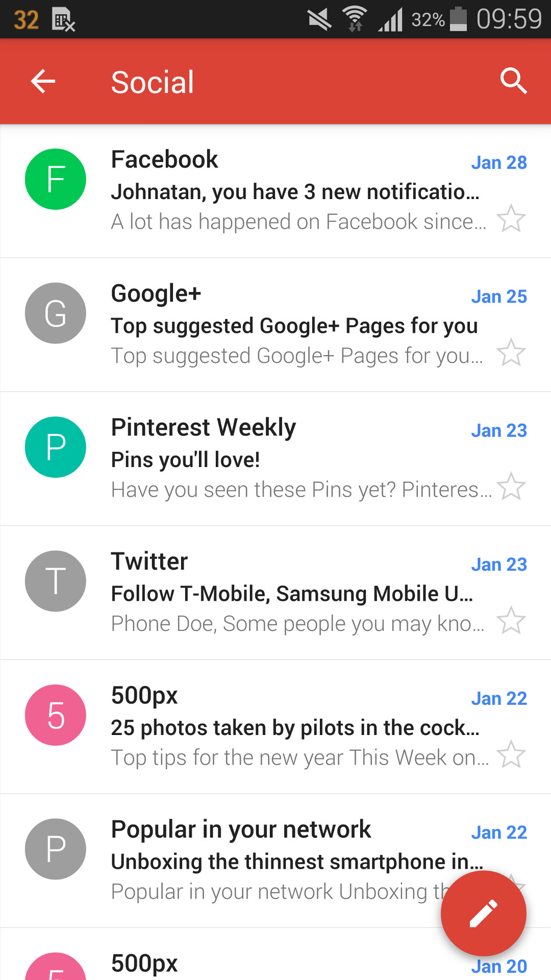
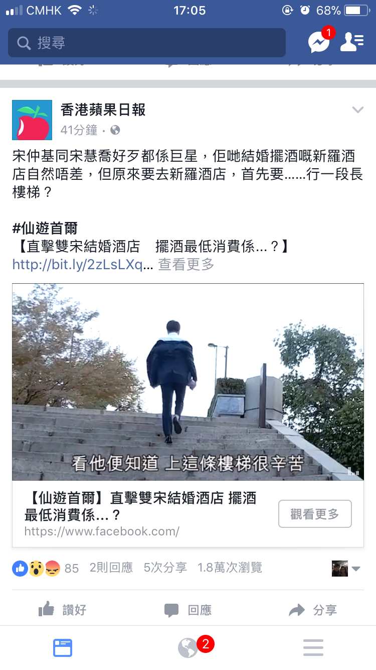
| Gmail | Spotify | |
|---|---|---|
 |
 |
 |
| Button is designed with brief information of an email and goto email details when user press the button. | The whole part before "like" button group is a huge button that contain feed's title, description, video, etc. It will swipe into Feed's detail page when user press the button. | Button is designed with square to contain background image, icon and title of a category. It will then swipe into song list of selected category when user press the button. |
Pressed:
It used to define action when a pressing motion is detected. Button is important in many ways such as page swiping, popup display, connect server, etc once user press the button.
Examples
Page Swiping when user press a button. The logic is showed below and ( ) is used to define the action we selected:
Page -> (Created) -> Button -> (Created) -> Text
                            -> (Pressed) -> Page
Popup display when user press a button. The logic is showed below and ( ) is used to define the action we selected:
Page -> (Created) -> Button -> (Created) -> Text
                            -> (Pressed) -> Popup